My collage shows the memory of place and includes objects that make up the ‘colonial order’ of Auckland city. The silhouettes and columns are recurring ideas in my proposed site map. The figures upside down represent the pre-colonials which had their land built on-top by colonials. The structure of the nature in Albert Park is also unnatural and also has order and symmetry to it, so not only buildings and pathways were controlled but the trees too.
Research for Site Map
The original map of Auckland
Proposed Plan of Auckland, 1841.
This plan of Auckland was made in 1841 by the surveyor-general Felton Mathew.
I noticed how ordered and grid-like the map had been proposed. Interestingly enough the ‘Trafalgar Circus’ looked surprisingly sort-of like the exisiting plan of Albert Park where the fountain is located, and other aspects of the park.
Existing Plan of Albert Park, Auckland Central.
I think that this plan done by Mathews will be useful for creating my A1 collage as it links to the colonial architecture of buildings in Auckland Central, such as the St Paul ST Gallery structured with many old-style columns.
This week we visited the site of where our project will be based. We walked from AUT across the bridge to Albert Park, where we drew sketches and took photos of the atmosphere. We made our way back to Wellesley St East and went into the lobby of ST Paul St Gallery Three – our main site for Project 2. I took photos of the exterior, the start of the threshold of the gallery. I was interested in the columns, as I think they represent the colonial order of our city, which extends out to the colonial structure of Albert Park – quite ordered with some symmetry.
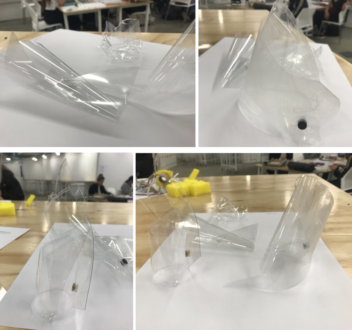
For this lesson we were told to bring in materials to model with. The models we created were to relate to our A2 Concept Drawing. I chose transparent materials to work with, as my concept drawing represents blurred rain veil. While these initial models were rough with little to no time to create, they gave me many ideas and techniques for me to use for my next model.
I am testing the effects of distortion, using transparent PVC with holes pierced through. I like the effects of how the real world window beyond blurs. I will therefore use this technique in my final model.
8 March 2019
Model Exploration
Materials I used: – Transparent PVC sheet – Acrylic sheet (patterns scratched on) – Water colour – Candle wax – A2 Cartridge Paper – Light source (iPhone flashlight)
I was really happy with the results from this second concept model and decided to make my final model in similar but stronger materials. I thought the projection of the light looked like a drawing on the other surfaces.
Finished Concept Model
I think that my final concept model relates to my initial idea of the sleep/wake state very much so. It describes the blurry rain veil vision and the atmosphere that I see when I wake up. While my model projects a rather subtle shadow, it completes the feeling of calmness and serenity that I feel when visioning this blurred rain veil.
Materials I used: – Thick transparent PVC sheet – Acrylic sheet – White Card – Candle Wax – Thin metal Wire – Pin Joint
Techniques: – Scratched patterns on the Acrylic screen (replicating some of the concept drawing) – Heated Acrylic screen and bent to make slight curve – Drilled holes through Acrylic base – Pierced holes through PVC statue column – Pin jointed statue column together – Threaded wire through statue column and base, and the curved card wall and base – Dripped wax liquid over statue column
The sleep/wake condition means that I experienced the underlying ‘ordered reality’ (of my bedroom) at the same time as a blurred veiled vision of rain, as I emerge from my sleep. I have experienced this vision since childhood. The drawing tries to bring the two conditions together with the underlying order being distorted/disturbed by the watercolour overlay.
8 March 2019
Method for my Concept Drawing
Pencil Drawing – ‘logic’ ie. real perspective / real world.
Shadow Smudge – real perspective / real world, starting to soften / blur.
Water Colour – veil of transparent colour (2x strengths).
Pencil Patterns – tried to disturb / distort underlying pencil ‘reality’ with patterns generated by the water colour curvy lines. Blurred pencil ‘reality’.
Eraser – More blurring of pencil ‘reality’, creating more flow (like water / rain).
Jean Nouvel I was inspired by the Nouvel’s amazing work ‘Louvre Abou Dhabi, Abou Dhabi, Émirats arabes unis’ and how the patterned roof relates to my own concept drawing. His work shows the overlapping layers allowing effects from light, depth and shadow. I hope to use light and projection in an interesting way for my own concept model.
Today we were introduced to the concept of Sleep/Wake and its differences and similarities. We were set a task to draw a series of blind drawings of what we see when we fall asleep and wake up, thinking about movement and light and darkness. Our next step was to look at everyone elses’ drawings to generate more ideas and techniques for our final A2 concept drawing. I was interested in drawings that used similar techniques to mine, for creating my concept drawing.
Ever since my childhood on waking and sleeping I have this vision of a blurred veil of rain. I can see it in three stages. So I’ve tried to draw this blurred state that visually I have lived with this image all my life.
First three (cropped) are mine, the others are for inspirational purposes to help me with my concept drawing.
30 February 2019
Today we were told to write about our concept, defining five key terms that describe our concept drawing. I came up with 5 main ideas to focus on. – Blur – Fluidity – Weightlessness – Distortion – Disturb
Cropped section of Final Drawing showing similar techniques to first series of drawings.