Atmospheric images of proposed 1:20 model.

Views of 1:20 with figures 

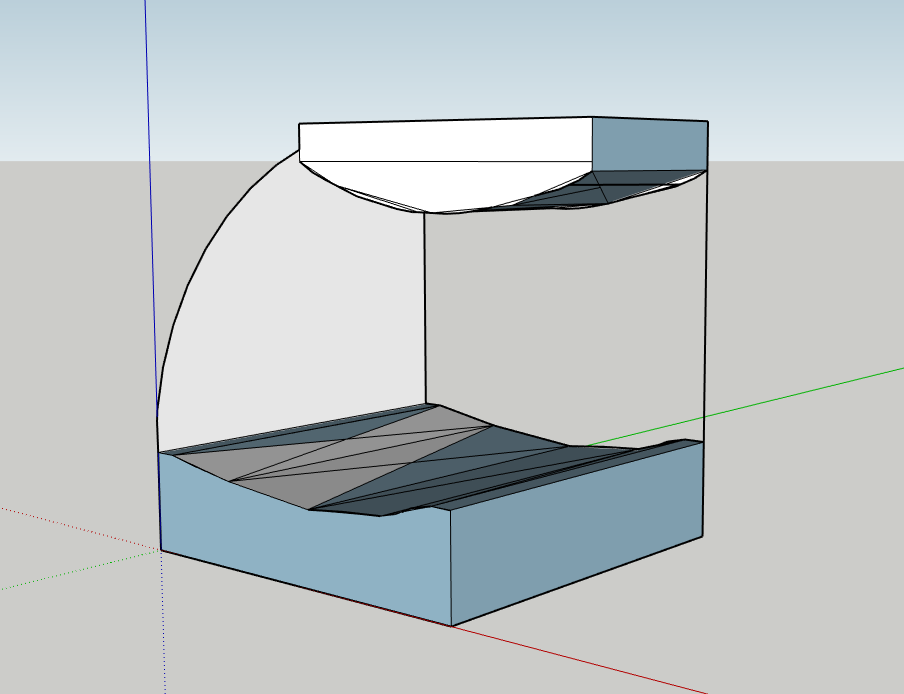
Interior Views 1:50 
My proposed sleeping platform design continues the light box, fluid effect (of the threshold) throughout the gallery space. In the process of design thinking I really liked the idea of continuing the platform from the threshold, that showed a bold narrative behind making the models.
When creating my 1:20 detailed model I had to consider sound and chose materials that would absorb it, such as wood. I also chose reflective surface materials, such as plastic, mirror and aluminium that continue the idea of fluidity and distortion, similar to the materials I used in my previous projects this semester.
I found drawing my design as a 1:20 section was very useful, as I could build on that template. Unfortunately because of my lack of knowledge using 3D drawing software, I was not capable of laser cutting my waffle structure, so I instead hand created it using cardboard. When building solid materials on top of my waffle cardboard structure, I realised that I had to strengthen the structure, so I used balsa wood to help keep the shape. At the end I went a step further and added fairy lights into the platform which gave a whole new feeling and showed a dream-like state.
The process of making my 1:20 model took much longer than expected, however I am very pleased with the result. While creating my sleeping platform design from digital, clay to cardboard and wood I have learned a lot about making models.
Materials I used:
– White cardboard
– Bulsa wood
– Bamboo
– Black cardboard
– Acrylic paint
– Purple satin
– Sponge
– Printing paper
– Transparent PVC sheet
– Fairy lights with battery
– PVA glue
– Tape
– Aluminium sheet
– Mirror
– Pins

Cardboard Waffle Structure of 1:20 Model